



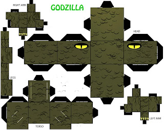
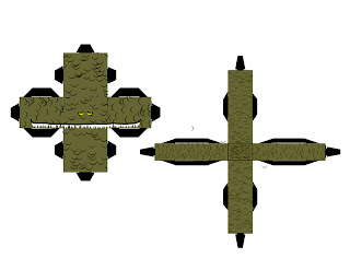
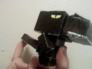
 When I had decided to go off-template for my papercraft assignment, I had no idea just how irritatingly complicated it would be. There were many things I had planned to add to my papercraft, but I settled on just an additional box for a snout, and a large rectangle for a tail. Many of my other attempts were complete failures, and I still have yet to actually print out and attempt this most recent one (although I WILL add a picture of the completed Godzilla by tomorrow, so stay TUNED!).
 This post contains an exceptionally tall image from one of my new favorite web comics VGCats (vgcats.com). I'm really new to comics, but there is a flow to most that can't be messed with, and although I could have photoshopped this into a square, I really like the flow it has as is. So just click to view!
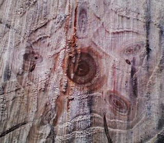
This week we went out and chopped down our Christmas tree from the Reuben Tree Farm out past Glendale. It took at least an hour of searching around before we found the perfect tree. Now we always tend to get a large tree, usually about a seven footer, but this year we just couldn't find the perfect tree in that size range. The one we ended up settling on was actually closer to 11.5 feet tall; this was a problem since the ceiling is only about 8 feet off the ground. After much effort cutting it down, though a massively thick trunk, I was suprised to see an almost perfect star pattern created by the tree's rings.
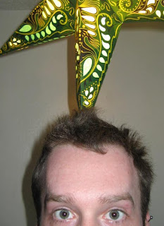
I took a picture, with my handy phone, and it looked even more defined on my little screen. I immediately uploaded the picture onto my computer, but upon doing so, I could barely make out the star pattern that had captured my attention. Remembering one of our lessons in lab, I used Photoshop to create a new layer and used the Overlay blend mode. Instantly the star popped back out in the picture. I had to do a few adjustments to remove the strikingly PINK coloring it inherited, but otherwise it developed into an interesting image.
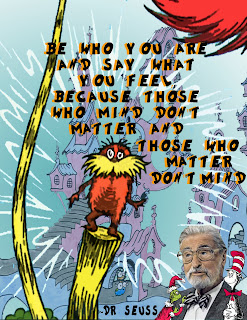 Out of all my collages, I think this is the one I am most happy with! I was browsing around, and I somehow found the above quote from Dr Seuss. I'm not one for cheesy phrases, but this one really has a nice feel to it I think. It's the same sort of thing that Hitler would say, but given that Seuss was emphatically anti-nazi back in his day, I will stick to the more positive implications. The quote itself, I believe, represents Seuss' work; not just anyone can invent nonsensical words and have several best sellers!
 As many close to me well know, I am quite the internet junkie. One of my favorite sites http://www.break.com has galleries posted all the time featuring images of all sorts (photographs/comics/imagery)--sometimes genuine, sometimes altered for a certain effect. The best part of these photographs is often the captions given to them.
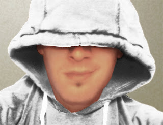
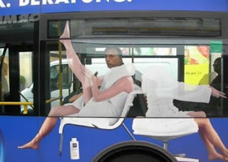
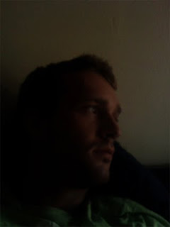 For the picture of myself, I actually spent a lot of time trying to figure out how I wanted the shot set up. I've never seen myself as photogenic, and I REALLY don't like the look of my goofy smile. At first I wanted to do something that represented me and my interests. I thought about doing something with me in front of my computer, or with my game systems. Everything turned out really posed, and I couldn't accept them.
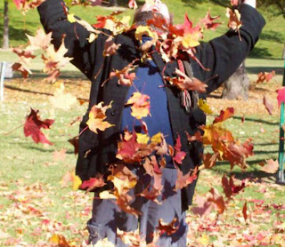
 Ta-DAH!! My new blog header has been created! For the longest time I found the idea of blogging to be an irritating hobby honestly, but I'm starting to develop an appreciation. Now that I've learned more about Photoshop, as well as creating/editing webpages in HTML, I really find the idea of a blog kinda fun! I've started to notice the huge variety of blogs people have, and it's not just kittens and celebrity stalkers.
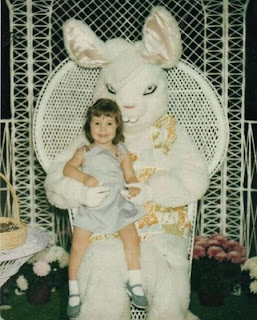 Our lecture on how some pictures are special because they were taken at just the right angle, or at just the right time, prompted me to post this image of an insanely creepy looking Easter Bunny. I'm sure that with the bunny's head tilted slightly upward, the costume doesn't look like a rabbit with evil intent. Or maybe the person who designed the head for this costume just really didn't take into consideration how creepy their creation truly is. In either case, I couldn't help laughing while looking at this image.

 While out at Lithia Park I really wanted to capture a letter from the beautiful little pond inside of the Japanese Garden area. With the way the leaves are set, and the reflection on the water a little above, I found that there was a darker area of the water that formed sort of a "V". Although imperfect, I think this is definitely my favorite shot.
 First off....IT'S NOT PORN! I was accused of being obscene when I first created this image, manipulated from another, in Photoshop for the purpose of using it as my MySpace background. For the life of me I can't find the original image, but initially this picture was of a guy--from behind--wearing briefs and angel wings for his Halloween costume. Somewhere along the line of me manipulating it, he ended up looking kinda nude.
 I've been really bad about posting on this blog lately; unfortunately I got sick and all my classes suffered. I'm finally catching up on everything though, and here's my first installment. When I was laying in bed feeling like I could hurl at any second, a good friend of mine sent me the above picture. Still feeling the urge to puke, this image managed to put a smile on my face for the rest of the day!

I actually discovered an image similar to this back when I was a Biology major a year back. One of the topics covered was diatoms, a class of microscopic organisms that were actually used often for aesthetically pleasing photography. With a variety of shapes and colors, the microorganisms are a perfect subject.
The above image is of Licmophora which looks like some sort of seaweed, but are actually invisible to the naked eye. Many examples of diatom art required painstaking arrangement of the subjects using VERY small tools. As the above image above shows, this process can yield very beautiful results.

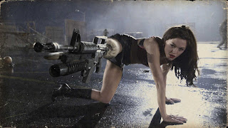
 In the spirit of Halloween and my zombie obsession, I did a movie poster featuring these subjects. I found a great filter in Photoshop called cutout which allowed me to give the cover a graphic novel look to it, which I personally really like. For the man in the foreground I actually used a picture of a guy holding a shot gun from a "Stargate: SG1" image, but the head on the body was not rendering well. From the previous lecture, I had found an image of one of the Lincoln assassination conspirators Lewis Powell. I was very struck by this black and white image, due to the intense emotion of the face. Even rendered in photoshop, the face still has an almost haunted look about it.
 For my HTML class, I was looking around online for a zombie hand to use in place of buttons on a zombie themed website I'm creating. I was having a lot of trouble finding just the right image, but decided instead that I might as well try to create one myself. The image above is a mixture of a picture of blood and a picture of my own hand. I sized the blood just right to fit the hand, then applied a few filters to give the texture a different look. For the coloring I actually played around a bit with gradient overlays, and eventually just set a low opacity over the majority of the hand to give it a dead look. I'm pretty happy with the results; instant zombie buttons!
 For the compilation I just started with the first letter, and then blew it up on the screen. I decided the character had a tree-like quality--and so the project began! It was very interesting to make since I needed so many y's; just the branches alone consisted of around 12 layers in Photoshop. For the leaves, to avoid a layers and transform tool nightmare, I actually just made a brush out of the "y" and played with the settings. It was a fun experiment with Photoshop.
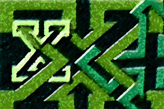 My first attempt at the text compilation, and I was actually really happy with it. The font Princetown LET is so blocky, and actually made the X's look like little puzzle pieces, which gave me the idea to weave the letters together. I also found all the arrows and shapes the interlaced text make with each other kinda interesting.


