12.4.10

Web Development Lab

Hello!

It's been a while since I've had anything worth posting (which will be the case for most of this term). No fun multimedia classes this term...just a lot of programming =(

However, my more advanced web development class is going to help me create some interesting stuff. We're not focusing a lot on design this term; the coursework is mostly programming interesting features into our pages, using a server to store information, ect.

The link below is to my newest lab, an extension of the first one, which allows users to input information and have it read back to them. It also contains a little slide show. It LOOKS really basic (and compared to most webpages today, it really is) but there's actually a lot going on behind the scenes that isn't seen. They're simple, but I had to write two java script methods for this program, both of which I feel I did very well. We'll see how much I've learned here in a few hours...I have a test tonight! =(

Enjoy!!

24.2.10

Midterm Video Production Project

FINALLY....here is my midterm project for my DMF Video Production class. I really wanted to do a commercial for an organization called StopTheHate, which brings attention to the fight against hate crimes aimed at the LGBT community. They do very good work teaching around college campuses the message that NO ONE should ever be a victim of violence. They encourage positive discussion which is a very good thing--no matter where you fall on the conservative/liberal spectrum.

I organized the video to be very chaotic and shocking, much like the content. I'm 80% happy with the flow (I think it tells a developing message fairly well), and probably about 70% happy with the music track. I've always wanted to take a class solely on audio, because when you're not doing it right it's pretty obvious. All in all I'm pretty proud of it though =)

ENJOY!


(By the way...there was a 10 second required title intro you might want to skip)

19.2.10

My Robot

Here's the first test of the robot I'm building/programming in class! It's so adorable looking.....the video is really crappy, and the space I had it moving around in was small, but basically it can navigate itself and will turn in a different direction when it encounters a wall or object.

By the end of the term it will be able to navigate through a maze without my help. I'm not sure quite yet how complicated that maze is going to be though.....that's my final for the class, so who knows.

Enjoy!


8.2.10

Lesson 7 Practice

Here's a video of me getting more practice editing clips down for a certain effect. Once again, this is nothing exciting yet, but it was fun to put together =)


27.1.10

Video Assignment


For this video, in my digital media class, I was basically handed clips and music and asked to piece them together into a video that was 14-15 seconds. It was really difficult getting rid of some of the main track, where the guy is talking about the dance steps, but I had a good time =)

I CAN DO THIS!!

~A

6.1.10

Web Dev 2...Site in Progress

This term for web development, I was warned we wouldn't be making really RICH sites. We are mainly focusing this term on getting down some of the conventions of working with web pages such as javascript to make our pages do neat little things.

Check out my new page in progress for the first lab at:

http://webpages.sou.edu/~robertsa/CS295/Labs/lab1image.html

10.12.09

Book Assignment


Week 10: Someone Else


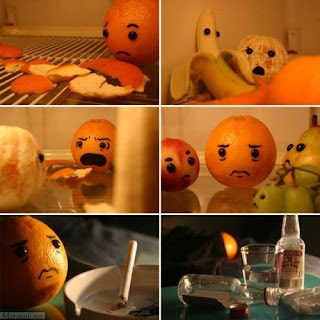
Maybe it's my current mental state, but I found this image to be incredibly funny as well as creative! An orange finds his naked mate in bed with another fruit, screams in fury, goes to friends for consoling, and then resorts to a lonely smoke and booze before bed (or at least that's what I get from it). I really love the lighting and placement of objects in this image--capturing emotion of FRUIT with simple little faces.

After all the blogging and image creation I've done for this class, I think I might start up my own blog of images plus commentary or even a web comic! I would really like to take an Illustrator class or some form of advanced Photoshop to accomplish this. Even if no one but my friends sees it, its been rather cathartic for me to just create, or even sit back and laugh at the humor of others creations. I don't think I could be an illustrator for a career, but continuing this blog sure would be a good way to build a portfolio! =)

Week 10: Me


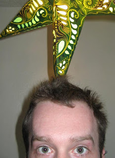
So being that it's finals week, I've been having a lot of discussions with friends via text about how stressed out we all are. I've been so stressed in fact, that I've had no inspiration for either my Week 10 post or the cover of the book I'm designing. One of my friends, who doesn't know me very well, was laughing when I said that today I looked and felt like a crazy psycho about to snap at any moment. He kept responding, "No.... hahahaha, you are too nice to be that crazy of a person!".

Oh REALLY?!

I stood up and took a picture of myself with my phone, wanting only the glare in my eyes to get the point across. The image above is the result of a couple shots I ended up taking, trying to REALLY capture the crazy I'm feeling. As luck would have it, my paper star-light hanging from my ceiling, ended up in the picture as well to really perfect this image. When my friend saw the picture I sent to him, he responded, "Holy f***......creeeeeepy.......and what the hell is above your head, psycho?!". If an image is supposed to convey emotion, then I think I've made my point! I like this image SO much, in fact, that I'm gonna use an altered version of it on the cover of my darkly funny book of quotes I'm making. Two birds, one stone! =)

Scratch Assignment


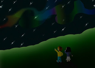
For my scratch assignment, I first created the "aurora" image immediately above. I was really happy with the way the Aurora Borealis turned out in this image by selecting an area with the Lasso tool, and then just applying a multicolored gradient over it. I had to play with the opacity and blur a lot to get it to look just right in the sky. I ended up adding a second "wave" of color, just to add to the effect of light in the sky. Total, with all the different components in this image, I ended up with close to thirty layers--many of which I ended up merging together so I could do the lighting/shadowing effects.
The snowman image was probably the most fun. I love the snow and after one of my recent posts which featured a snowman, I decided it would be fun to play with the lighting effects of snow. I did it much less blended than with the aurora, but that was for the intended cut-out paper type look it has. Originally, I just had a snowy landscape, the trees, and the snowman. After discovering that I have ZERO skill to make anything resembling a tree trunk, I decided to kinda cheat and use an additional mound of snow to kinda block the hideous tree trunks I had created. Hopefully it wasn't obvious I was taking the easy route by doing that. =)

8.12.09

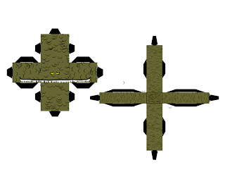
GODZILLA!! Papercraft


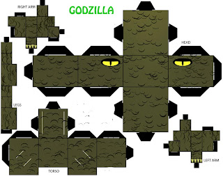
When I had decided to go off-template for my papercraft assignment, I had no idea just how irritatingly complicated it would be. There were many things I had planned to add to my papercraft, but I settled on just an additional box for a snout, and a large rectangle for a tail. Many of my other attempts were complete failures, and I still have yet to actually print out and attempt this most recent one (although I WILL add a picture of the completed Godzilla by tomorrow, so stay TUNED!).
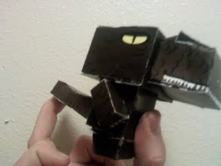
My biggest problem was trying to get the realizm that you are looking at Godzilla, rather than just a large lizard. But I suppose if I know what it's supposed to be, that's all that really matters. It's hard to make a cartoon-like Godzilla without it looking a little goofy (one of the reasons I gave him a toothy grin). However, I did get great enjoyment messing around with this flat color design, and I'm excited to see how it turns out......and yes, his head is going to be MASSIVE!

Week 8: Someone Else

This post contains an exceptionally tall image from one of my new favorite web comics VGCats (vgcats.com). I'm really new to comics, but there is a flow to most that can't be messed with, and although I could have photoshopped this into a square, I really like the flow it has as is. So just click to view!
Having never read many comic books as a kid, I'm finding more and more that webcomics are definitely up my alley. VGCats in particular tends to theme most of it's entries around video games and the industry producing them. The above image is actually one of the few that were done simply as a Christmas entry, but still in the usual darkly funny style. I have no experience using Adobe Illustrator, but I'm thinking it's what was probably used to create this. I can imagine the headache of doing this in Photoshop, but it is possible of course. The gradient mapping alone of the colors is very richly done, and would probably make my head explode if attempted. Someday I hope to have even greater skill for my own designs; people like me with stunted art skills need a lot of practice and digital help! =)

5.12.09

Week 8: My Work


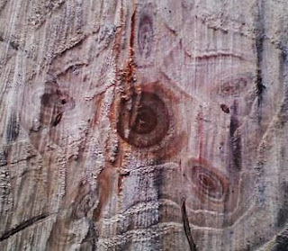
This week we went out and chopped down our Christmas tree from the Reuben Tree Farm out past Glendale. It took at least an hour of searching around before we found the perfect tree. Now we always tend to get a large tree, usually about a seven footer, but this year we just couldn't find the perfect tree in that size range. The one we ended up settling on was actually closer to 11.5 feet tall; this was a problem since the ceiling is only about 8 feet off the ground. After much effort cutting it down, though a massively thick trunk, I was suprised to see an almost perfect star pattern created by the tree's rings.

I took a picture, with my handy phone, and it looked even more defined on my little screen. I immediately uploaded the picture onto my computer, but upon doing so, I could barely make out the star pattern that had captured my attention. Remembering one of our lessons in lab, I used Photoshop to create a new layer and used the Overlay blend mode. Instantly the star popped back out in the picture. I had to do a few adjustments to remove the strikingly PINK coloring it inherited, but otherwise it developed into an interesting image.

1.12.09

Late Week 7: My Own Work
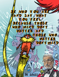
Out of all my collages, I think this is the one I am most happy with! I was browsing around, and I somehow found the above quote from Dr Seuss. I'm not one for cheesy phrases, but this one really has a nice feel to it I think. It's the same sort of thing that Hitler would say, but given that Seuss was emphatically anti-nazi back in his day, I will stick to the more positive implications. The quote itself, I believe, represents Seuss' work; not just anyone can invent nonsensical words and have several best sellers!

The quote itself made me think a lot about my favorite childhood Seuss character the Lorax--the prophetic tree-hugging activist. It just seemed to fit as a central image for the quote. I found another image of a city, which I'm pretty sure was drawn by Seuss as well, but if not at least fits the spirit of his whimsical drawings. My happiest find for this collage was an actual Dr Seuss font that I downloaded and used within Photoshop--something I'd never attempted before. I included another clipped picture from the Seuss tribute postage stamp, took out a few characters, and it as well seemed to fit perfectly for my purposes. The characters surrounding him, if not all characters he's ever created, all seem to share the same trait of speaking their minds.

30.11.09

Late Week 7: Someone Else

As many close to me well know, I am quite the internet junkie. One of my favorite sites http://www.break.com has galleries posted all the time featuring images of all sorts (photographs/comics/imagery)--sometimes genuine, sometimes altered for a certain effect. The best part of these photographs is often the captions given to them.

This image in particular was captioned "Ahh...Old Time Misogyny" for quite obvious reasons once the background is brought into closer view. I honestly don't know that I would've noticed the implied gender roles of this board game's cover without it being drawn to my attention. Additionally, it's one of those images that makes me laugh so hard mainly because I can't believe it was PURPOSEFULLY DESIGNED this way! Was it really necessary to add in the mother and daughter washing dishes? Couldn't this image be just as complete without it? It's almost like the person really thought that women would love nothing more than to do housework and watch men have fun playing a game! I wouldn't even come CLOSE to saying that images surrounding my generation are devoid of bias, but it's very interesting to me how direct of a message this image sends out. I'm definitely keeping this image in reserve for the next time I hear something about "The Good Old Days"! =)

Late Week 6: My Work


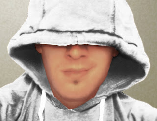
For this week's post, I decided to have a bit of a challenge for myself. I was looking through tutorials about Photoshop, and I happened to stumble across a comment from someone mentioning how hard it is to change black clothing to appear as white clothing. I made it my mission to try this out!

For starters, I didn't have a very high resolution camera to take a picture of myself with, so the above image didn't give me a whole bunch to work with as far as clothing texture. I definitely was trying to retain as much of the proper shadowing as possible, but in the midst of levels, curves, color balance adjustments, dodge tool, burn tool, ect.......I ended up with what looked like glowing gray clothing. ADDITIONALLY, I was so focused and zoomed in on the clothing, that I didn't notice some accidental texture and color changes I had made to my skin. By then it was too late.

I probably should have scrapped this image while I had the chance, and started anew. However, after literally 3 hours of focus on altering just one image, I WAS NOT GOING TO BE A QUITTER! After I got the clothing to look reasonable, I switched gears to my face, applying filter after filter to different parts of my face; film grain helped me look like I had SOME facial texture, and a good scattering of other textures made it look slightly less like I was wearing lipstick.

Maybe this image is just a big fail, but in all I've seen people proudly present much worse on their blogs, facebook, and myspace pages. If anything, I've learned a lot lessons on controlling what I'm working on, so that if certain types of changes need to be made later it isn't impossible.

29.11.09

Late Week 6: Someone Else


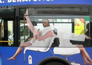
Advertisements, to me, are societies way of dumbing us down and making us insecure. That said, it's a career I've often considered! People's ability to not question what they see just AMAZES me sometimes. Whether its the photo of a celebrity, altered to make them look 20 years older for the tabloids, or even the occasional ad that makes a model look so perfect even angels are getting eating disorders. That said, I think that taking control of what people percieve is a very powerful job. Creating images that make people LONG for your product is a money making and often dangerous business.
If I were in advertising, however, I would aim for the effect of the above image. It's so OUTRAGEOUSLY clever of a way to sell lotion! I have to wonder if the man on the bus really knew why someone was laughing and taking pictures of him.

Me, A Friend, and the Other

For the picture of myself, I actually spent a lot of time trying to figure out how I wanted the shot set up. I've never seen myself as photogenic, and I REALLY don't like the look of my goofy smile. At first I wanted to do something that represented me and my interests. I thought about doing something with me in front of my computer, or with my game systems. Everything turned out really posed, and I couldn't accept them.
Later one particular evening it happened to be raining really hard, and having just been through some very personal challenges, I was feeling very blue and lonely. I laid on my bed just thinking about my life really. Before I knew it I realized I had been sitting there for two hours just looking out at the rain, actually feeling very peaceful. My camera happened to be nearby, and without disturbing my expression or pose I snapped off a couple pictures. I really thought it might be took dark of a pic, and maybe it is. But to me it feels like a captured moment when my life kinda made sense for two hours.

My friend Chris is very similar to me in a lot of ways; many of our interests are similar, and we both HATE getting our picture taken. Hence, maybe it was just my perverse sense of humor that drove me to taking HIS picture amongst the lot of my friends. When I came to his house, we kept arguing back and forth about where the picture would be taken. I had ideas, but since he was begrudgingly letting me take the picture I couldn't push him out the door.
One of his favorite things he owns is his fish tank, and I can always count on him calling me and telling me all about whatever new additions he has made to it. Additionally, one of my favorite memories of our friendship is when he helped me set up my own tank, and we both sat in front of it for about an hour, in the dark, eating Taco Bell, and watching the brightly colored fish. To mimic that moment, as well as a way to get him to let me take his picture, I tried my best to capture a moment between him and his prized fish.


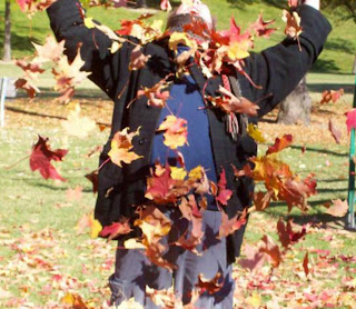
For starters, I am NOT a person who approaches strangers easily. This assignment burst my hermit bubble--very unhappily I might add. In order to find someone doing something interesting, I actually ended up walking through a couple of parks. I came across a couple who were playing in the leaves. The guys, oblivious to the strange looks he was getting from his girlfriend, was going CRAZY playing with leaves. I shyly introduced myself, and suprisingly they were very open to me picturing them. All my pictures of the girlfriend ended up looking very posed! If she wasn't sticking out her chest, she had a sort of crazy/fake grin on her face. The boyfriend, however, seemed to get a genuine enjoyment from those leaves. Although I never asked what, I really got the impression from this guy that the fall leaves were attached to some sort of happy memory. I chose this picture because in contrast to my own picture for this project, which I decided on days before, this guy seemed so full up life. Either that, or I missed some sort of drug deal moments prior.

Late Week 5: My Work

Ta-DAH!! My new blog header has been created! For the longest time I found the idea of blogging to be an irritating hobby honestly, but I'm starting to develop an appreciation. Now that I've learned more about Photoshop, as well as creating/editing webpages in HTML, I really find the idea of a blog kinda fun! I've started to notice the huge variety of blogs people have, and it's not just kittens and celebrity stalkers.

For this image I decided to go with both a technology/expression theme. The abbreviation DMF is made of three images. For the "D" I decided to use a computer screen, being the obvious mode of expression in digital media. I found a cool looking graffiti "M" picture, invoking the idea of art and photography as well as typeface. I wanted to do something original for "F", and I kept googling for something that represented a sort of silent expression of the letter. At first I was planning on just using an image of an "F" in sign language, but decided I'd make the reference a little more obvious by adding the letter into the image. All in all, I'm pretty happy with my new header; although, for the life of my I can't change the green background of my blog.....right now the overall presentation kinda screams "GREEEEEEEEN"! =)

28.11.09

Late Week 5: Someone Else

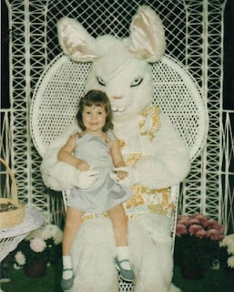
Our lecture on how some pictures are special because they were taken at just the right angle, or at just the right time, prompted me to post this image of an insanely creepy looking Easter Bunny. I'm sure that with the bunny's head tilted slightly upward, the costume doesn't look like a rabbit with evil intent. Or maybe the person who designed the head for this costume just really didn't take into consideration how creepy their creation truly is. In either case, I couldn't help laughing while looking at this image.

In my own experience taking pictures, it has often been the most unintentionally funny pictures that bring me the most laughs. Whether it's a person who was talking, and their mouths just happen to be at a weird angle when captured on film, or a blink that makes them look like they are stoned, it is often hard to pose a truly funny image. I imagine this is how the paparazzi get their AWFUL pictures of celebrities; if you keep following someone and continuously take pictures, you are sure to get an image that appears to have a meaning or theme that is way out of context.