25.10.09

LATE Week 3 Post: My Work


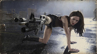
Continuing my work for my zombie themed website for my Web Programming class, I have added a page featuring my favorite zombie movies. The caption on top is from "Planet Terror" which is actually the first movie to truly test my gag reflex. Rose McGowan with a gun leg, however, gives you the delight of seeing zombies getting blown up in a creative fashion.
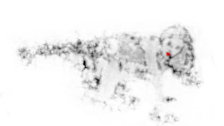
MY image on the bottom was intended to blend in with my color scheme of simple black and white with a hint of color. I wanted the images to almost look like smoke--very choppy, with only the important details showing. I have NOT perfected this image yet, but the progress is making me happy so far. Most interesting to me, at this point, is the several filters, layers, ect. that lead to the latter image. I honestly don't know if I could repeat it on another image. Since I have five more movie pages to complete, I'm going to have to figure something out!

LATE Week 3 Post: Someone Else

I actually discovered an image similar to this back when I was a Biology major a year back. One of the topics covered was diatoms, a class of microscopic organisms that were actually used often for aesthetically pleasing photography. With a variety of shapes and colors, the microorganisms are a perfect subject.

The above image is of Licmophora which looks like some sort of seaweed, but are actually invisible to the naked eye. Many examples of diatom art required painstaking arrangement of the subjects using VERY small tools. As the above image above shows, this process can yield very beautiful results.

Movie Poster #2

Continuing my graphic novel type design from the previous poster, I decided to play a little more with motion in this poster for "2012". Palin, after going all out, has lost the elections. Crazy as she is, her rage is unleased upon the unsuspecting people of the United States (minus Alaska). The poster is actually just a collage of 3 images: one atomic blast, one crater, and one image of a family skipping through a park. It was interesting to me that once their expressions were wiped off their faces, they fit perfectly as a family running for their lives.
The picture itself is really noisy, which I was kinda going for. I like dramatic simplicity better, but the contrast of the foreground and noisy background still appealed to me. I played a lot with outer glows on all of my layers to really make them pop. Especially in the case of the atomic blast, I think the glow really helped my contrast the title from the explosion behind it.

Movie Poster #1

In the spirit of Halloween and my zombie obsession, I did a movie poster featuring these subjects. I found a great filter in Photoshop called cutout which allowed me to give the cover a graphic novel look to it, which I personally really like. For the man in the foreground I actually used a picture of a guy holding a shot gun from a "Stargate: SG1" image, but the head on the body was not rendering well. From the previous lecture, I had found an image of one of the Lincoln assassination conspirators Lewis Powell. I was very struck by this black and white image, due to the intense emotion of the face. Even rendered in photoshop, the face still has an almost haunted look about it.
The zombies in the background are actually two layers of the same image. One is made smaller and also edited a little so it looks different enough. If you look closely at the picture, you can tell some of the zombies are actually repeats.

12.10.09

LATE Week 2 Post: The Zombie Button

For my HTML class, I was looking around online for a zombie hand to use in place of buttons on a zombie themed website I'm creating. I was having a lot of trouble finding just the right image, but decided instead that I might as well try to create one myself. The image above is a mixture of a picture of blood and a picture of my own hand. I sized the blood just right to fit the hand, then applied a few filters to give the texture a different look. For the coloring I actually played around a bit with gradient overlays, and eventually just set a low opacity over the majority of the hand to give it a dead look. I'm pretty happy with the results; instant zombie buttons!

Text Compilation #2: "Y" in Lithos Pro

For the compilation I just started with the first letter, and then blew it up on the screen. I decided the character had a tree-like quality--and so the project began! It was very interesting to make since I needed so many y's; just the branches alone consisted of around 12 layers in Photoshop. For the leaves, to avoid a layers and transform tool nightmare, I actually just made a brush out of the "y" and played with the settings. It was a fun experiment with Photoshop.

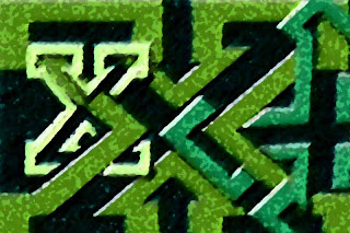
Text Compilation #1: "X" in Princetown LET

My first attempt at the text compilation, and I was actually really happy with it. The font Princetown LET is so blocky, and actually made the X's look like little puzzle pieces, which gave me the idea to weave the letters together. I also found all the arrows and shapes the interlaced text make with each other kinda interesting.

11.10.09

Second Collage


As someone who figured out their sexuality very early on, I have quite a few years of dealing with anti-gay hatred. I found this collage especially fun to do, although it disconcerns me a little how many MORE hits came up on "anti-gay" than with "pro gay" on a Google Image Search. Collage is the perfect medium for political sentiments!
On a technical note, the transform tool has definitely become my friend!

Week 2: Someone Else


Friends of mine are tired of hearing my love for my "Corportate Zombie" t-shirt, but I can't sing the praises of graphic artist NikHolmes ENOUGH for creating this image. I'm a bit of a zombie fanatic, and when I stumbled upon the shirt with this logo at threadless.com (a graphic design contest site) I almost died of joy!
My obsession with zombies stems from the fact that things that terrorize me often become my obsessions in life. It's basic psychology....I desensitize myself to my fears by exposing myself to the source. The newest "Dawn of the Dead" movie scared the pants off me, hence now I squeamishly play zombie games all the time now. Graphic t-shirts have become such an over used market these days, that it's hard to find shirts I want to buy.
This shirt, however, is about the cutest rendering of a zombie you will ever see in your life. Graphic design has become a large interest in my life, due to illustrations just like this little guy.

LATE Week 1 Post: My Own Work


This is actually an image I did some rendering on for my friend, Levi, a couple years back. He was wanting some unique images of himself to send off to a modeling agency. Levi knew that I had done some image editing for Fire Mountain Gems, so he sent me a couple images. I WISH I still had the original to this photo to show, but it basically just used to be a black and white snapshot of him on a blanket in a park. I took the park out of the image, and colorized the image, including a tattoo of flames that he has on his shoulder. The visual quality TO ME of this image is not so great, but Levi seemed to really like the surreal look the colorization gave his skin.
After doing this picture was when I really started realizing that there could be career opportunities playing with pictures--or at least at being good in doctoring them! I had an ancient version of Photoshop that I used to do this image, but I found that I could really enjoy myself using the program. It seemed like a good start towards a potential career.

LATE Week 1 Post: Someone Else


With the hustle and bustle of the first couple of weeks of classes, I totally forgot about doing my blog posts. I thought I'd like to start with someone else's work, I'm always much to critical of my own. One of my favorite sites is http://www.worth1000.com which is full of photoshop contests. The picture above is a submission for a contest titled Wrong Turn 2--putting animals in places they don't belong--by a user named Alan2640. When I look at this picture, and think of all that Photoshop can do, it reminds me of what made me want to major in Computer Science. Although a creation such as the gold fishes in the jello are simple, they are amazing. I look at other peoples work and am inspired, thinking, "I could do that", and then I go try and create something amazing myself. For a truely NON-artistically talented person as myself, digitial media has opened up a lot of doors.

6.10.09

First Collage


I had a lot of fun with this project. I had just seen something on the 2008 elections, so I figured it'd be fun to do a collage on just how major someone's "image" is to their success.